Nice Details

Setting reminders after midnight with Siri
I was up late recently and around 1am I asked Siri "remind me to do laundry tomorrow morning". As it was after midnight, "tomorrow" could have meant either what was technically later that morning, or the day after that. In these situations, Siri asks a clarifying question to confirm which day you meant.
I imagine this feature has saved a lot of people from setting reminders on the wrong day. I know it did for me.

RingGo's live activity
Live Activities is a feature of iOS where apps can display a dynamic banner on your lock screen. It's relatively new so not many apps support it.
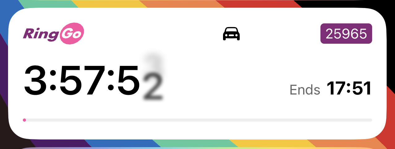
One app that does support it is RingGo, an app used by many UK car parks. When you start a parking session it automatically adds a live activity to your lock screen to show you how much time you have remaining.
It's a great use of live activities, and an excellent example of an app putting users over their own interests. They could make more money if they obscured how much time you have left because it would increase the chance of you having to pay a fine, but they didn't go down that route.
Not-so-nice details

Glassdoor
Glassdoor is a website where people can anonymously review their employer. Generally they seem like a pretty good company, like when they've gone to court to try and protect the anonymity of their users, but their login screen leaves a lot to be desired.
The checkbox just above the Continue with Google button is very difficult to read. Can you read what it says in the image above? If you can't, it says "Click here if you do not want to receive marketing emails from Glassdoor and affiliates".
Here we have not one, not two, but three dark patterns in use:
- It's incredibly difficult to see
- It's counterintuitive, as you have to tick the box to not receive emails
- You have to tick it every time you sign in to Glassdoor, not just initially
For a company that goes to such lengths to respect their users' privacy in one regard, it's surprising that they seem to hold such little respect for it in this sense. It's disappointing and I hope they do better in the future.
And finally
That's all
That's everything for this issue.
If you enjoyed it, share it with your network. If you didn't enjoy it, share it anyway.
To submit content for inclusion, message me on Mastodon @[email protected], Twitter @shauneba or email.
For more of my work, check out my iOS apps Personal Best and Taylor's Version.
Until next time!
