Welcome
Welcome
Welcome to Nice UX Design: a celebration of the small details we find in products that elevate them and make them greater than the sum of their parts.
Each issue features some examples of nice details from the digital and physical worlds, along with the occasional not-so-nice detail where things could have been improved.
To submit content for inclusion, message me on Mastodon @[email protected], Twitter @shauneba or email.
For more of my work, check out my iOS apps Personal Best and Taylor's Version.
Nice Details

Using iOS's Stocks app in China
In most countries, the Stocks app on iOS uses green if stocks are up, and red if they're down. However, in China red is seen as a symbol of luck, and doesn't have the same negative connotations as elsewhere. The Stocks app follows this trend and swaps the colours around, a neat bit of subtle internationalisation.
gov.uk's Bank Holidays page
The UK government's website is well known for having a thoughtful design that prizes accessibility and usability.
One page that really showcases this is the bank holidays page. They realised that most people are coming to the site to find out when the next bank holiday is, so it's front and centre as soon as you visit the page.
A hidden detail is that you can add .json to the URL (gov.uk/bank-holidays.json) and you'll get a JSON representation of the page's data.
A fun detail included in the JSON that isn't on the regular page is the bunting property, which tells you whether or not jaunty flags are appropriate.
Not-so-nice details

CAPTCHAs on the PlayStation store
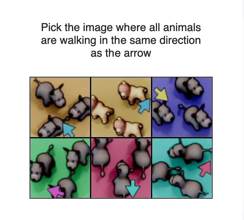
We're all familiar with popups asking us to click on all the traffic lights or type in a weirdly-distorted number to prove we're not robots. Recently I was logging into the PlayStation store and was taken aback by theirs, which I've never seen before.
I genuinely can't tell if this is great or terrible. It feels like an abstract logic puzzle from an IQ test, and it took me longer than I'd like to admit to complete it.
