Welcome
Welcome
Welcome to Nice UX Design: a celebration of the small details we find in products that elevate them and make them greater than the sum of their parts.
Each issue features some examples of nice details from the digital and physical worlds, along with the occasional not-so-nice detail where things could have been improved.
Nice Details

Absolute dates on GitHub
When using GitHub, you can hover over any relative date and see it in absolute terms.
Every website should adopt this pattern as it's very useful to have both formats available.

Image lookup in Photos on iOS
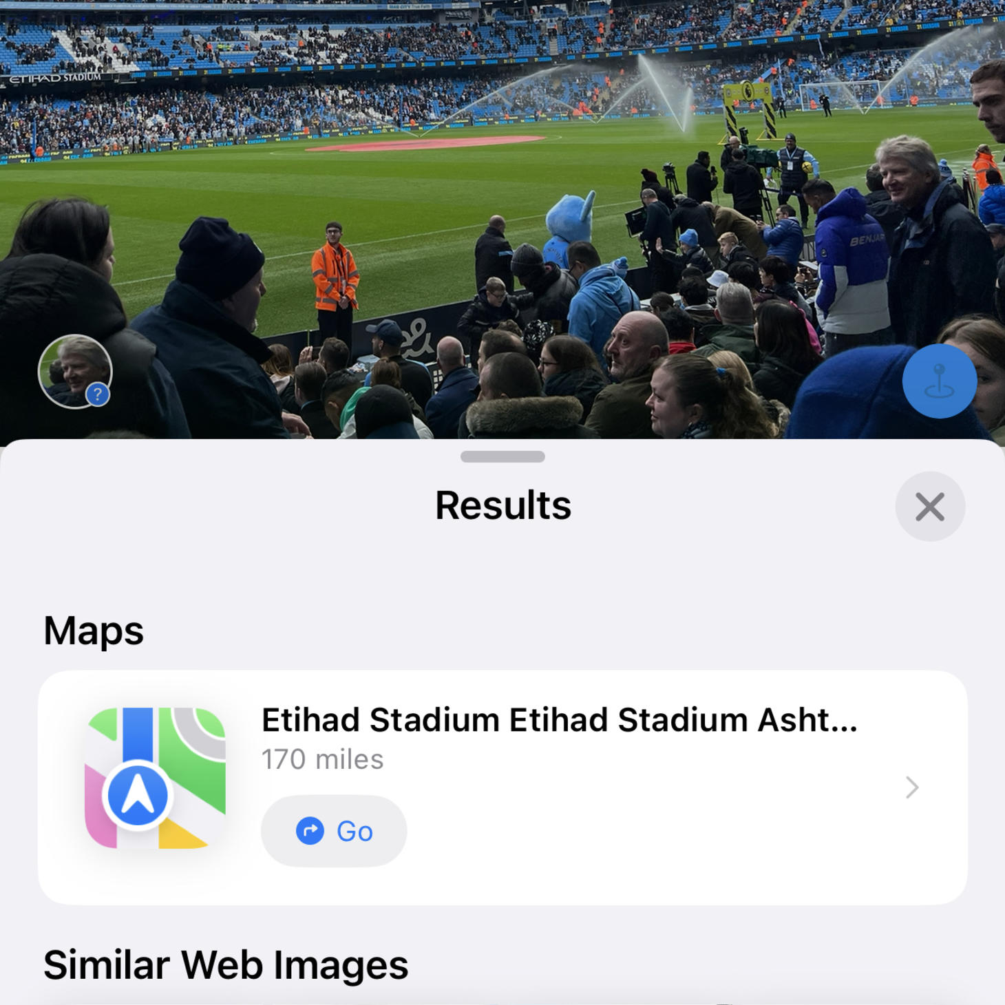
In iOS's Photos app, when viewing an image you can tap the i button in the bottom toolbar to see details about the photo. With some photos the icon has some sparkles on it, which means iOS has recognised the content of the photo and allows you to look it up.
Here's an example from my phone where it was able to recognise the stadium I was in and show similar photos from the web. It works on a lot of different things – for example it can also recognise types of plant and species of birds. On a recent trip I saw a nice-looking plant and used this feature to identify it, which was really handy.

Opening times in Google Maps
Recently I noticed that when you start navigating somewhere on Google Maps, if your journey time means you're likely to arrive after it closes, Google will let you know this before you leave. I bet this has saved people a lot of unnecessary journeys.
Image credit: Techlicious
Not-so-nice details

Figma's 'open in desktop'
Figma has a web app and a desktop app. Links open in the web app by default, so they have an option to always open links directly in the desktop app. A more accurate name for this setting might be "Open links in Desktop about 50% of the time", because it seems very unreliable. Figma's user experience is otherwise brilliant, so this really stands out as a place that could do with some more care.
That's all
That's everything for this issue.
If you enjoyed it, consider spreading the word by sharing it with your network.
To submit content for inclusion, message me on Mastodon @[email protected], Twitter @shauneba or email.
For more of my work, check out my iOS apps Personal Best and Taylor's Version.
Until next time!
